Any statistical analysis must start with a descriptive analysis where you:
start feeling comfortable with the data (quantitative/qualitative, units, …)
handle appropriately missing values (if any)
check for possible outliers
start about thinking of possible statistical approaches for your problem
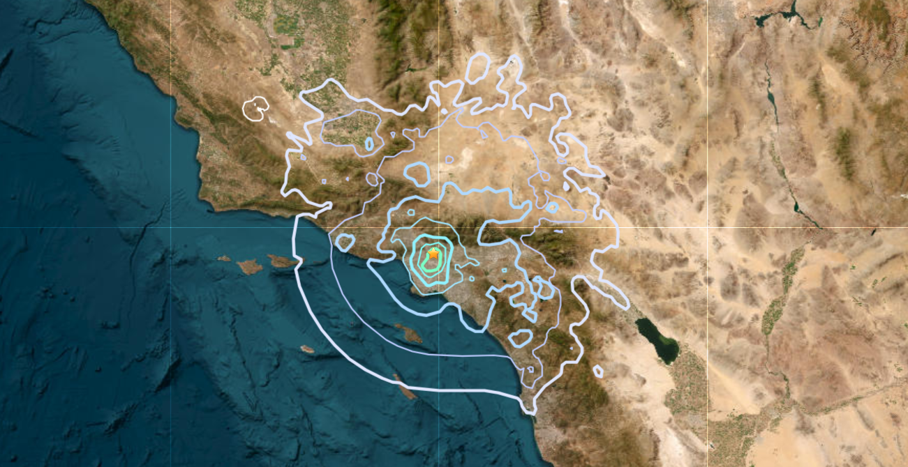
To get familiar with descriptive analysis, we will work with the attenu dataset which gives peak accelerations measured at various observation stations for 23 earthquakes in California. This dataset can easily be retrieved from the following piece of code:
This dataset has the following variables: event number, moment magnitude, station number, station hypocenter distance (km), peak acceleration (g).
🖍️ Make sense of each variable?
No answer here just use your brain.
🖍️ Are there any missing values?
Write answer here.
🖍️ Which variable is quantitative? What about qualitative variable (and if any, are there ordinal)?
Write answer here.
🖍️ Because we learnt during lectures that numerical values may be misleading or rather applied in the wrong way, it is good practice to start your analysis with some plots. But let’s pretend we are not aware of that and just use summary statistics of the dataset.
summary(data)
     event            mag          station               dist
 Min.   : 1.00   Min.   :5.000   Length:182         Min.   :  0.50
 1st Qu.: 9.00   1st Qu.:5.300   Class :character   1st Qu.: 11.32
 Median :18.00   Median :6.100   Mode  :character   Median : 23.40
 Mean   :14.74   Mean   :6.084                      Mean   : 45.60
 3rd Qu.:20.00   3rd Qu.:6.600                      3rd Qu.: 47.55
 Max.   :23.00   Max.   :7.700                      Max.   :370.00
     accel
 Min.   :0.00300
 1st Qu.:0.04425
 Median :0.11300
 Mean   :0.15422
 3rd Qu.:0.21925
 Max.   :0.81000
What is displayed here? Comment.
🖍️ Give an histogram of the peak acceleration. Your histogram should be normalized! Don’t forget to add label the axis of your plot. What can you say?
## Insert code here
🖍️ Give some summary statistics, i.e., mesure of location and dispersion, for the peak acceleration variable. In particular compare the sample mean to the sample median and comment?
## Write code here
🖍️ Plot the evolution of the acceleration w.r.t. the distance and comment. What about the evolution of the acceleration w.r.t. the event?
## Write code here
🖍️ Compute the association between peak acceleration and distance between the station and the hypocenter.
## Write code here
🖍️ Using a QQ-plot, graphically assess if the acceleration is Gaussian. And log-normal?
## Write code here
🖍️ Using boxplots compare the distribution of acceleration for magnitudes in \([5, 5.5), [5.5, 6), \ldots, [7.5, 8)\).
## Insert code here
💪 Your turn: Indice de position sociale des lycées
Just have a look at the following webpage, get familiar with the dataset and import it.
There are some categorical variable and you might want to tell that to R using the factor function.
In this part you’re free to to whatever you feel relevant. For instance you may consider doing a dotplot for the mean IPS for each department, compare the IPS for GT and PRO, the evolution of IPS through years, some qq-plots…